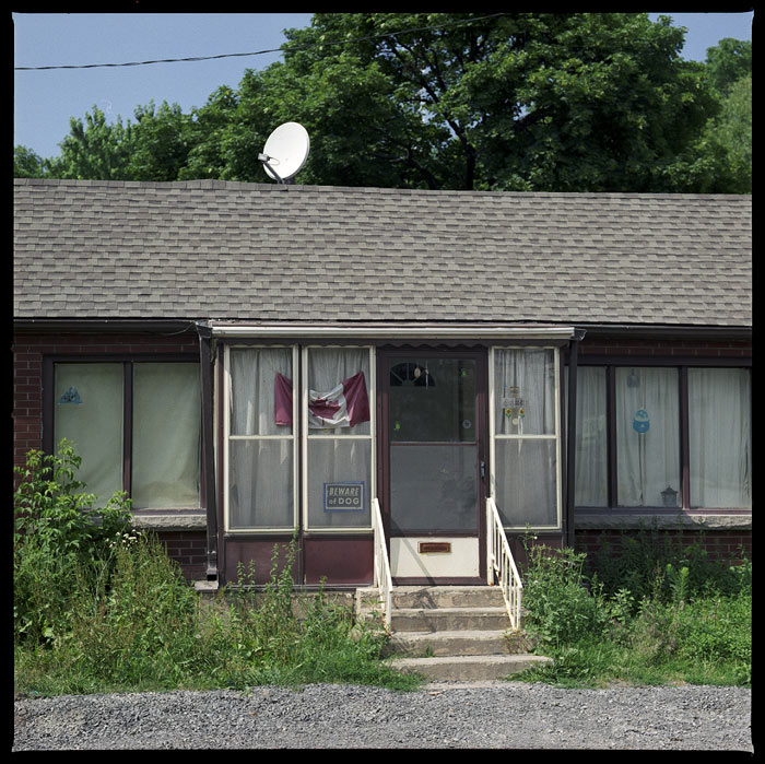
I took two views of this house: this photo and one from the front/side. The sideview had a more appealing composition but I opted for this view since the satellite dish (and accompanying company logo) featured too prominently in the side view. It dated the image and I hate that.
